30 June, 2008
Rothko The Courageous
Not long ago, the BBC series, Simon Schama's Power of Art, aired in the USA. I had the unfortunate experience of seeing Schama's segment on Bernini. On the one hand, I learned a great deal about the artist, but decided to quibble with the historian.
Then I had the chance to see Schama's segment about Mark Rothko, in part, on You Tube. Having just re-read the TASCHEN book on Rothko, I was thrilled with this video. The Power of Art series reenacts key, historical artists' lives in vignettes, with narration and lecture by Schama, who is compelling in his writing and not a bad speaker.
Historian and art historian Simon Schama, in the year 1970, took a wrong turn in the Tate and was confronted, unexpectedly, by the Rothko Room. He admits, and I think very transparently, that when he realized it was the Rothko display, he expected to see the "cemetery of abstraction...a dead end". Instead, he was transported.
"This isn't about now,
this is about forever.
Can art ever be more complete; more powerful?
I don't think so."
Simon Schama on Rothko.
In this video, Schama illuminates Rothko's courage as an artist, and the essential quality of his art that transcends paint and canvas. I have no argument with this opinion!
The Seagram Murals at the Tate Modern.
28 June, 2008
Studio Interior
 Welcome To My Studio. North Light at Left; West Window on Right. From Left to Right: My Custom Palette Table, Bookshelf, and L-Shaped Desk.
It is a life changing event
to have a big, new studio.
Last year we installed and leveled the 14 foot by 60 foot house trailer that was to become my art studio. Before the winter, we trenched in the electricity and my new studio was electrified. After that, I had to replace the floor substrate and lay linoleum in the kitchen and studio room. Then I moved the balance of my furnishings in, and went to work.
The studio building has two bedrooms, the larger of which is for framing and the smaller for storage. The bathroom, which is not yet plumbed, serves as more storage, and the pantry, by the back door, is mat and large frame storage, with a cupboard for common tools such as drills, hammers etc.
The kitchen is a flex-space, with a large pantry for storage, wall space for mounted book shelves, my file cabinet and two flat files for paper stock and originals waiting to be framed. Recently, we began cutting glass here.
A recent addition was a bookshelf that I surplussed from the old Seattle REI store. Complete with pegboard back, I now have well-organized tools and accessories. My desk, shown in the picture below, faces the front door, and allows me a dual use surface for business and some drawing.
 Brown All-Around. The Original Paneling May Be Low-Rent, But it Has The Advantage of Being a Neutral Value for Displaying Art Against.
My laptop comes and goes from the house, and when it is in the studio it provides tunes with a nice speaker system. I have a relay for internet, but somehow it decided to quit working and so I rely on a dim signal for limited internet use.
The studio is north facing, but large pane windows also face west and east. Here in sunny Eastern Washington, the Southern exposure can be brutal, and so it is nice to have the bulk of the trailer insulating me from that awful orb. I keep the west windows shaded in the AM, and the east is blocked in the PM.
The studio is north facing,
but large pane windows also face west and east.
Additional artificial light is provided by various sources. My former drafting table light now covers the palette, and track spots with alternating warm and cool cans provide the additional light I need for the big easel. A wall mounted easel allows me to mount bigger paper, since the mast of my big easel bumps the low ceiling and denies the big sheets. My convertible easel, which becomes a table, moves from the studio to the kitchen. Several knock-down tables provide additional flexibility.
Future Plans:
The skirting on the trailer needs to go on, and an already purchased air conditioner will be installed, hopefully before August. The plumbing will be served by a septic and drain field system.
A section of drywall will be put up in the studio with display lighting. I also want to add an outdoor "pila" sink, and a deck that may accept an easel, or provide covered outdoor seating and sleeping space.
The big plan? I want to break ground north of the studio proper, and lay the foundation for a pole built addition that will be the new, new studio. The trailer will remain office, storage and framing. The addition will be at least 20 feet by 20 feet, with a minimum of 9 foot ceiling height. The dream is to have north light via skylight and/or picture windows. Limited to no side windows, of course.
25 June, 2008
Leonardo da Vinci Researcher
Leonardo da Vinci
Consider this link, including my own information, and heavily relying on Charley Parker's collection of links, as your start to researching Leonardo da Vinci.
Endure the links, and you will be rewarded with a wealth of LdV information.
Spotlight on Leonardo
My posts on da Vinci.
Our heroic artist and definitive Renaissance man, Leonardo da Vinci, was born April 15th, 1452, in Vinci by Florence, Tuscany. His hometown is a hilltop one, situated originally with a castle and the wall that follows the hill contours - a classic Italian style.
I fancy the little hamlet that da Vinci was born in, because it is at the end of the road (I think). A small and unassuming (well, unassuming other than the fact that they changed their name to "Vinci") comune in the Apennines that is like so many others that I visited two years ago in Northern Italy. It is quite near Pisa and Pistoia.
Charley Parker has probably the best set of da Vinci links, but don't miss his interesting reverse image of the Mona Lisa and a captivating story of his own encounter with the image.
I had the pleasure of viewing the Codex Leicester by da Vinci in Seattle, after Bill Gates purchased it. If you so desire, the download prompt for his collection of notebooks (free e-book) can be found at this page.
For your pleasure, here is a very nice, thrifty Chianti with legs: Cantine Leonardo da Vinci. Are you looking to be a great artist? Put on your list of "must haves" a wine label of your own.
Universal Leonardo dot Org.
24 June, 2008
22 June, 2008
Wiki Warning

Since many of us art bloggers utilize Wikipedia for our references, I thought this article would provide fair warning. The Scotsman article doesn't provide a casual link between the falling test scores of students, and the Wikipedia usage of the students, but the link seems plausible. Maybe reporters aren't what they used to be either, eh?
Catherine C. Marshall has this well written defense of the Wikipedia concept versus the dust collector style of old school encyclopedias. Some parents won't let their little redheaded girls wear red dresses. Her parents wouldn't let her use encyclopedias at the library. She reminds us to go to primary sources - you'll be the better for it.
One of the tests that I place on my own Wikipedia research is to avoid factual statements based on a Wikipedia article. I get other resources involved. Usually the beginning of further research is found in the links section at the bottom of Wiki articles.
Can you tell by the way an article in Wikipedia is written whether it bears value or not? I am more impressed with articles written with thorough content (more data) and with attributions. As a matter of fact, a grammatically well written article , with interesting content, tends to get my seal of approval.
Does the gist of the Wikipedia article agree with other articles about the subject, both in factual content and in opinion? That can reveal a big red flag if the Wikipedia is too far from the norm of broader scholarship.
Take this article on Picasso, for instance. What I notice is that it uses many links, and that the sections are very brief. Links are not attributions. The overall article is longish, but I'm not sure that I'm getting anything really meaty. Maybe it provides a starting point for those who know absolute zero about the 20th century master, but I'd be quick to find other sources here.
Now, compare the article on Leonardo da Vinci. Granted, da Vinci is the subject of more scholarship by virtue of the times he lived in and the fact that his work is a half a millenium old, rather than a half a century for Picasso. But, the point is the da Vinci article does a thorough job of covering many facets of the great master's life. After the biography comes painting, then non-painting legacy, and then it reflects upon his legendary status. Included is a list of paintings, a worthy list of footnotes and a bibliography and links round it out. There is even a pronunciation .ogg file for his name offered at the top. Looks like they missed this really nice link, though: universalleonardo.org.
Do use references in your art studies, but keep it accurate to the best of your abilities. The blogger world is reading.
19 June, 2008
Art Is As Art Does
http://news.bbc.co.uk/1/hi/uk/7445327.stm
While I am more than happy to see actual art critique coming from a newspaper, it is difficult to take this one at face value. No wonder Bob Dylan has been shy to show his artwork. I think he knows it won't be a free ride, and it is inevitable that his paintings will be held up against his song writing and music-making talents as a comparative measure.
I have news: there is no comparison anywhere to Dylan's song writing. He is his own genre, and the word genius is certifiably and forever attached to him in the music world. Now, how does anyone, including the fine artist Bob Dylan, ever stand up to that?
The following vid has Dylan's work in print in a Scottish venue (small and new gallery).
Here we have a Welsh gallery opening, but the proprietor's word-rich interview almost puts the truth to the Beeb's negative spin.
Thanks to Katherine for keeping us up on the Bob Dylan art events.
18 June, 2008
Book On Color
I read with a critical eye, and am an enthusiastic supporter of this exhaustive tool for the serious pastelist. The benefit I will take from it is that I can accurately compare my jpegs and slides for jury against my actual artwork. As it is impossible to represent true pigments in the CMYK color space (photography & print) I am often frustrated when my art is represented incorrectly. This gem of a book actually lists the particular colors of pastel not rendered by CMYK. My tactic in the future will be to submit for jury those artworks that stay closest to the CMYK color space.
Thank you, Huechroval! A longer review will be forthcoming here at The Colorist.
Note: the book from publisher Huechroval is titled: "Multi-Brand Color Chart for Pastels".
16 June, 2008
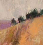
Olive Trees & Paint
 Olive Trees & Paint
21".5" x 14"
Pastel, Charcoal and Liquid Pigment
on Diane Townsend Paper
Casey Klahn
This is a companion piece to the work that I posted about a week ago, Olive Tree Grove.
On the subject of color, I don't know if I've ever posted about the non-objective colorist Joanne Mattera. Joanne is a blogger organizer, as well as a fine essayist on color. See her current exhibition post, Awash in Color: "No Chomaphobia". And, her recent post on color wheels is not-to-be-missed. It features some dated but fun color wheels, and a survey of some talented colorists that she recommends.
Here are some embedded videos of her Art Blogger Conference:
If you have some trouble loading these videos, I offer you the You Tube Addresses:
Part 1
Part 2
15 June, 2008
Deciduous Trees Series
At my blog "Pastel", I have been posting about my series of deciduous trees. See them here and here. The second link includes some of my Five for Friday instructional tips exclusive from my studio. What that means is that I am opening my head, and disgorging thoughts about pastel technique.
My goal is to be roughly 75% - 80% original in these pastel instructional tips. I have received word that a venue may be forming soon which will allow me the opportunity to teach workshops. Put me in the school of those who take teaching as a strict calling, with no small requirement on the preparation side. These Friday tips at Pastel have been a lesson plan builder for me. And now you know the backstory on that.
12 June, 2008
Wheel Versus Real

Katherine Tyrrell, at Making a Mark and her other web sites, is engaging in a two month long study of colour. I think this will become one of the best organized references available about color on the web. I will be participating by studying the characteristic of "Intensity".
First, some groundwork on color theory.
Of course color is a problematic study. Opinions vary, and dogmatism can be a booger. Artists may be dogmatic based on what they learned in art school. People who use computer-based color applications will be off in their own strange world, adding lights of various colors to their white base. Painters will vary a little from print makers, and the dye-using artists also differ in their color models.
The important thing to remember is that points of view exist, and to keep in mind that you need a point of view that works for you. But, it doesn't hurt to be grounded in reality, either. So, measuring results helps. Science brings us that.
If science gives us conceptual theories, we should also feel indebted to Modern Art for uncoupling artists from the hegemony of visual perception. What I mean is this: I don't care at all how other's "perceive" color, or what the "mean average" is for perception of a given color, What I care about is how I use colors!
Put a different way, there has been much written about the ineffable state of color. Colors are perceived differently from person to person; visual perceptions are the result of mental processes and even psychology; cognitive and computational variances; blah, blah, blah. I don't want to ignore the science, but there is an intrinsic color there in the pigment and it behaves the same from day to day, your "perception" be damned.

My own recent studies of color have me occasionally pitching fits because the dominant paradigm on the internet is based on computer uses of color. When artist's use of color is addressed, it often is delivered through the lens of the new paradigm, and what results is misinformation, mistakes and generally not useful stuff for the pigment user.
In a rare entry of clarity, the Wikipedia on the Color Wheel has this to say:
There is no straight-line relationship between the colors mixed in pigment, which will vary from medium to medium. Whereas with a psychophysical color circle, the resulting hue of any mixture of two colored light sources can be determined simply by the relative brightness and wavelength of the two lights, a similar calculation cannot be performed with two paints. As such, a painter's color wheel is indicative rather than predictive, being used to compare existing colors rather than calculate exact colors of mixtures. Because of differences relating to the medium, different color wheels may be created according to the type of paint or other medium used, and many artists develop their own individual color wheels. These will often contain only blocks of color rather than the gradation between tones which is characteristic of the color circle.The difference between the artist's pigment "color wheel" and the other color theories is best understood by the different colors anchoring them. Red, Yellow and Blue are the primaries of the pigment user because they cannot be mixed from any combination of other pigments. The science oriented, and the print maker or computer user, will identify some other set of base colors because of how light functions. I want to call that "experiential", and the pigment based paradigm I want to call "elemental".
I also want to wretch when someone wishes to impress on me that the "real primaries" are Red, Green and Blue because of so-and-so's color circle theory, or because of the way one's eye perceives color. Fine, I say. Show me that with paint on a palette!
So much for my color model position. Next: Intensity!
Skip these links if your brain hurts thinking about color as perception:
Qualia - Mind numbing experiential theories including color perception.
Paper on the Ineffability of Color.
11 June, 2008
Atelier Update
Artistic growth is a lifetime process. I recently reviewed Classic Drawing Atelier, A Contemporary Guide to Traditional Studio Practice, 2006, by Juliette Aristides of Seattle. Jen Graves, also in Seattle, has written a savvy article about the atelier, it's larger Academy of Realist Art context and the place of classicism in our contemporary art environment.
09 June, 2008
Round Up
This may be an "open head - disgorge thoughts" post. The reason I put it that way is I'll be darned if I can find a common thread for all of them.
First, this Wolf Kahn interview is from The Brooklyn Rail, and WK has some new things to say. He gets into process versus results. I like what he says about his disagreement with Clement Greenberg on the subject of "flatness". And he pays homage to Hans Hofmann, his Modernist teacher. Do follow the link on Hofmann, which leads to a stunning new website ( I think it's new, anyway).
Read the interview even if you're not that "into" Kahn, because he has a great lot to say about artist's self doubt and discipline. You can't help but feel good about your own work, even if you feel like a failure sometimes, if you adopt his attitudes.
And, the keeper quote from WK is this:
I’m not so involved in description because I think that the greatest sin an artist can be accused of is telling people things that they already know. And you can write that down and put it in italics. Our aim as artists is to use ourselves as agents for expanding possibilities; and if you’re just doing something that’s conventional and everyday, you’re not doing it right. Of course, we constantly struggle against our own conventions because that’s one of our worst difficulties—trying to avoid doing something that we already know how to do.On the subject of Washington State Art Bloggers, I missed a local artist in my last post who is blogging and has a fascinating life story as a fourth generation artist. Kathleen Cavender.
Wolf Kahn with David Kapp and Robert Berlind
Over at my blog Pastel, I have been doing a Plein Air Project. I have an interesting plein airist to show you who works in oils, however. Jason Waskey, from Seattle. His usual fare is daily still life paintings, but he is on a road trip and posting his small daily works and a photo of his easel set-up in front of his landscape subject. And, as if that's not enough, he adds a map reference, too. Great fun.
Lastly, I have been keeping this blog I found a secret for long enough. Enjoy looking at Old Paint, which posts a dated artwork or illustration and labels it by artist and year.
07 June, 2008
Art Hanging in Langley

Be sure to take a day and visit The Karlson/Gray Gallery in Langley, WA this month. Don't wait for a sunny day, either. I enjoy the beach in the rain better than the big city, don't you?
06 June, 2008
Remembrance
"The Americans who fought here that morning knew word of the invasion was spreading through the darkness back home. They thought--or felt in their hearts, though they couldn't know in fact, that in Georgia they were filling the churches at 4 a.m., in Kansas they were kneeling on their porches and praying, and in Philadelphia they were ringing the Liberty Bell."
President Ronald Reagan.
Note: This WW II photo doesn't look exactly like Normandy to me, but the idea is there.
05 June, 2008
Olive Tree Grove
Adam asked how one uses a photo reference and yet spins the artwork freely away from representation. I had to think about that. I won't post the photo, since it isn't mine and I use it by permission. And, besides, I make it a habit to not post photos of my subjects.
The departure point for a painting like this must be mostly in one's imagination. I am picturing specific artworks by artists that I admire, and in this case they are the numerous orchards that van Gogh painted, and a particularly intriguing Italian olive grove that Wolf Kahn painted where the scene is mostly obscured by thin layers of gray paint, as if in a fog.
I want to have my outcome be much more about the artist's works I remember, than about the photograph that I see. These artist's images reside in my soul and look for a way to find expression in my art. But, the photo inspired me by offering a basic composition of a group of trees with one in the foreground. And, for giving me some foliage to portray.
The recent Wolf Kahn Project here at The Colorist has had me doing some reductive type works, where I erase and rub pastels as a technique. And, it had me doing something I don't often do, which is portraying deciduous trees. You know I live in a state so overwhelmingly grown over with conifers that they are engraved on my brain.
An amazing amount of rule breaking and ignoring went along with doing this olive grove image. In fact, my mind was delivering these, "must do" messages at a rapid-fire rate, and I was deflecting them with my shield of abstraction every time!
"Justify that edge!" the voice would demand. "P-tchoo-wee," the shield deflects this comment with a ricochet.
"Balance the image! Heeeyy! Balance!"
"The horizon, man! Where is the horizon line?"
And, the granddaddy of them all: "Either get that focal point to the side or, or, for heaven's sake put something in the middle!!!"
So, of course, I left the middle entirely free of anything. No pigment, no elements - just paper.
That's how one processes a free form, abstracted landscape. I guess.

And also, I am pleased to be the BOSHart Blog Art Blog of the Day.
02 June, 2008
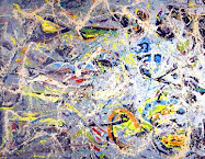
Mark Tobey, Famous Artist

Casein on composition board, 48 x 28" MoMA
"I wouldn't wish fame on a rat!" Mark Tobey, after winning the most prestigious Venice Biennial City of Venice prize.
Mark Tobey (1890-1976) was an abstractionist whose interest was centered on form. That is profoundly confusing to me, since my own feelings about abstraction are that form would be almost the last element the artist wants.
Tobey is the guiding light of the Northwest School artists, and pre-saged Jackson Pollock.
A short synopsis of his achievements:
Tobey won international acclaim for his work towards the end of his life. He became the first American since James Abbot Whistler (1834-1903) to win the Painting Prize at the Venice Biennale, an award he won in 1959. In 1961, he had a retrospective showing at the Louvre in Paris, an extraordinary tribute to the work of a living artist. These landmark achievements were followed by a major exhibition at the New York Museum of Modern Art in 1962 and, in 1974, another major show at the National Collection of Fine Arts in Washington, which is part of the Smithsonian Institution.
Art critics and historians in the United States have long been uncertain exactly how to categorize Tobey. Many gave Pollock most of the credit for creating the all-over style. Others have suggested that Tobey's internationalism and even his religion have so far kept him from being accepted in mainstream art circles.
Short Bio via the Peggy Guggenheim.
Long bio via Washington State's HistoryLink.
Committee Mark Tobey.
MoNA (Museum of Northwest Art)


